


Expanding the visualization toolbox: Lessons from a Tableau training
Visualizing results is a crucial part of our work at CWTS and essential for interacting with our audience. Consolidating and enriching our knowledge of the Tableau software in a two-day advanced course was one step in that direction. Here, we share some of the experiences and lessons learned.
A large part of our daily work at CWTS consists of collecting, analyzing and presenting data - be it in our research, for institutional projects, or for our research agency. Over the years, CWTS has paid particular attention to developing conversational and participatory approaches to understand science and its dynamics. One way of doing so is to use tools that enable communication with stakeholders and that involve researchers, research managers, policy makers, funders, and other stakeholders in the dialogue about science. Pertinent examples may be the interface for the Leiden Ranking, or the VOSviewer software with a recent update that facilitates sharing network maps online - very much in step with calls for more interactive and accessible visualizations.
As a consequence, our work revolves a lot around questions such as: How can I optimize the way I am sharing my work? How can I make best use of tools to provide more insights? And of course, we are aware that expanding one's toolkit can open up entirely new possibilities. When it became clear that the reporting of results was one aspect in which we could be more advanced, we took a closer look at Tableau.
Using Tableau at CWTS
You could think of Tableau as a very advanced form of Excel - but the comparison is not really accurate. As a “visual analytics platform”, Tableau focuses on making data more accessible to people, especially by means of visualization. This was what we were looking for - a solution that could facilitate interactive dashboards and dynamic, tailored reports.
Two years ago, a team of colleagues from CWTS had followed a Tableau Fundamentals training to learn the basics of Tableau. We put this new knowledge into practice right away - for example in a project around the uptake of online media attention for Covid-19 publications. Recently, we wanted to improve our Tableau skills further, so we took an advanced course in Tableau. Besides the more technical aspects, taking the course was an opportunity to reflect on our work processes and on how we create visualizations more generally - but also on how we acquire such new skills.
Consolidating our knowledge
During the two days of training, we revisited fundamental Tableau concepts, including special calculations, the order of operations, and data modeling. (Apparently, getting those concepts right is crucial for a smooth workflow in Tableau. It’s worthwhile investing a bit in understanding them!) We were also acquainted with new practices using our own data models (e.g., building advanced visuals and validating calculations).
When it came to thinking about visualizations in the course, one lesson hit home in particular: You have to consider the message that you want to communicate through the graphs produced in Tableau. Ultimately, this comes down to thinking visually, not so much from the perspective of a reading, but an exploring user.
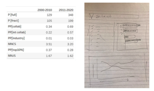
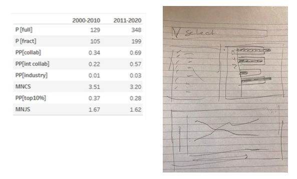
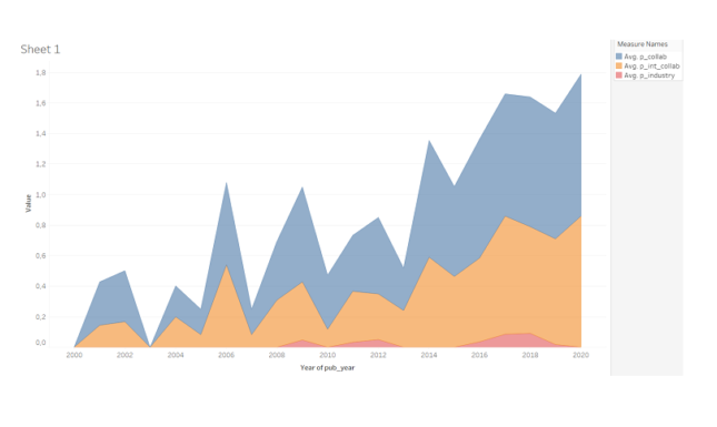
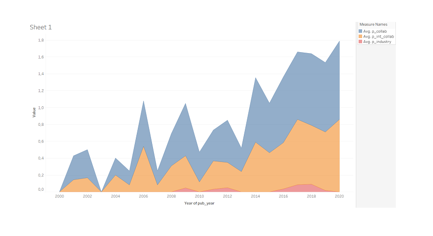
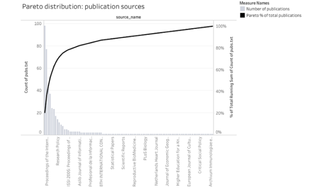
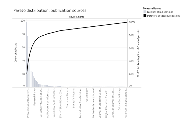
At the end of the second day of the training, we worked on an exercise in which we were asked to use a table (Table 1) that contains indicators that we commonly use at CWTS and redesign it by using pencil and paper and a splash of creativity. After drawing the visualization on a piece of paper, it was time to build this visual in Tableau. At the end of the practice, we shared our work and discussed some of our attempts (see Figures 1-3).
On learning a new tool
What is the best way to ‘learn’ a new tool? Of course, a thorough course is a good starting point. However, nothing beats “learning by doing”. You have to ‘struggle’ through the whole process yourself, repeatedly. Also, we noticed that in the time between the basic and the advanced course (1.5 years), the knowledge acquired got lost quite easily without continuous practice.
The complexity of the data that we use (working with publication ids with different affiliations, different authors names, etc.) can be a challenge. A brilliant team at CWTS is dedicated to evaluate the data collected and aims to provide a consistent and transparent curation. So the preparation of the data is done in-house. However, creating relationships and using joins in Tableau can be rather tricky, especially when you are used to the transparency of scripts e.g., in SQL. After all, you don’t want to ‘lose’ any data!
Related to that, we found that it requires some time to appreciate the benefits of Tableau when you have relied on other tools for a long time. This is part of the learning process itself and requires some reflection on your processes and workflows. In the end, you have to find out how and where to fit in Tableau.
One attractive element is the possibility to publish the dashboards online via Tableau online or Tableau public and to allow the reader to become an active user. They can interact with the visualizations (e.g. choose a certain filter and/or dig into more detail). However, what is important to keep in mind is that we need to be very explicit in what we want to show and to label the titles, etc. adequately to make it comprehensive and intuitive for the readers.
Conclusion
Following this (online) training was quite intense but most certainly valuable for our organization. Learning new possibilities to visualize our data allows us to think critically about dashboards for our audience.
However, having the many options offered by Tableau also makes you rethink your way of working - how you prepare data, how much time you spend on visualizing results, up to the delivery of results and visualizations. While previously, we relied a lot on reports delivered as Pdfs or Word documents, we may now as well share interactive dashboards. Here is where a good understanding of how visualizations work best comes in handy.
Working with Tableau is not a solitary exercise and does not only involve the maker and the audience. It is a matter of teamwork as well: acquiring skills in the specific context of our work requires transferring and exchanging knowledge among colleagues. Other options are to work with templated solutions for recurring problems. This notion was captured very nicely by one colleague: “the most important asset of the training was to get together. It will lead to more synchronized approaches and visuals”.
Photo credits header image: Agence Olloweb
Disclaimer: This blog post reflects the authors' opinion only. It has not been sponsored in any way.
0 Comments
Add a comment