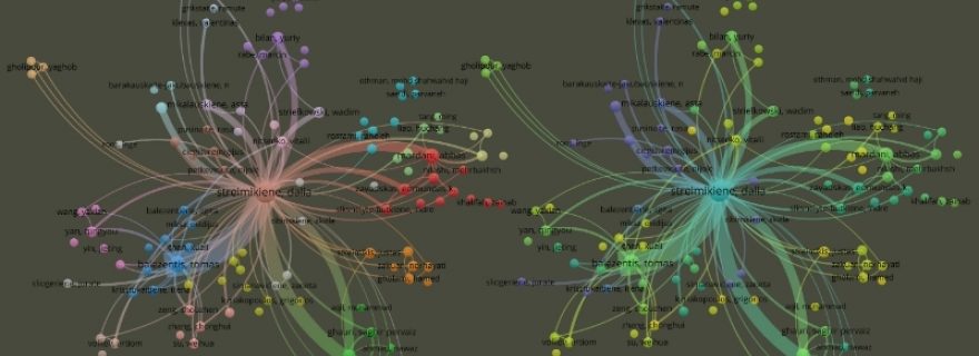
Visualising quantitative data with VOSviewer will widen your research projects
VOSviewer is a well-known and widely used software tool visualising quantitative data. Learning to use all VOSviewer’s features through guided instruction was an exceptional and new experience for us. In this post, we share some of our recent experiences in mastering our science mapping skills.
The course “Visualising Science Using VOSviewer”
VOSviewer was developed to construct various networks based on scientific literature. One type of maps is co-occurrence networks of essential terms. They provide an overview of the topics in the publications. Other networks are bibliometric; they are based on co-authorship or citations. Such maps represent connections between researchers, their institutions, countries, or journals and individual papers. Researchers worldwide use VOSviewer to create, visualise, and explore networks based on textual and bibliographical data.
To be sure, it is easy enough to start using VOSviewer and learn how to employ all the available features independently. The VOSviewer website contains a comprehensive manual and advice on getting started. It also provides numerous examples and links to additional relevant sources.
However, the tool’s developers—CWTS bibliometrics researchers Ludo Waltman and Nees Jan van Eck—also hold an annual course to help researchers familiarise themselves with VOSviewer. What could be better than a course run by the developers of the tool you want to use efficiently? For us, it was an excellent opportunity which took only four afternoons, but our proficiency improved considerably.
Fostering the learning progress
Before the world was forced to move online, it seemed impossible to many of us to learn new things effectively via online classes. But for Visualising Science Using VOSviewer, the online format posed few problems and had some unique benefits.
For one thing, holding the course online made it possible for participants to communicate with others from all over the world. When we got some time for introductions and informal chats, we found out that it was an early morning for the Americans and almost night time for the South Koreans. Besides sharing our interests in VOSviewer, we talked about snowy weather, music and hobbies (“Are these guitars behind you real?”), and so forth.
Even though the lecturers advised us to use the datasets most relevant to our investigations, they also prepared some that we could use in our practice sessions. They offered a well-structured package of comprehensive course material.
The course itself took place via Microsoft Teams, and when somebody was struggling to comment in Teams, Ludo and Nees created a Slack channel. It was convenient for participants to have an additional communication channel with lecturers for questions and answers. Even after the course ended, activities in the Slack group have continued so far.
Participants varied in their research backgrounds and in their ability to move from one unknown feature to another. Even so, this course has a very pleasant balance. We comfortably moved from listening to theoretical knowledge all together to doing practical assignments in smaller groups. When problems arose, anyone could share their screens and seek immediate, expert help and attention from Ludo or Nees. In this way, we not only efficiently solved our own issues but also learned from others. Finally, over the course, we gained more ideas on how to further explore our datasets.
Moreover, those who elaborated on advanced projects or just needed more time for clarifications were able to set up individual consultations with Ludo or Nees, who devoted time so that everyone had all their enquiries answered. This option benefited participants significantly.
Coming feature of VOSviewer: online presence
At the last session, we had the fantastic opportunity to create our maps using a beta version of VOSviewer Online. This allowed us to share our discoverable networks with anyone curious to examine them further. Below you can find the maps we created over the course in VOSviewer Online.
Eleonora was curious about looking at the national accomplishments of her home country, Lithuania. She created traditional co-authorship networks of countries collaborating with Lithuania, based on bibliographical data downloaded from the Web of Science Core Collection:
This course gave her greater confidence in her mapping skills, so she shared her networks with Lithuanian readers.
Qianqian likes an overlay visualisation, another VOSviewer network functionality. The overlay map can, for example, clearly show the changing pattern of terms over time. This is useful as it reflects the development of a particular research area. Such visualisations are vital for studying the evolutionary trend, trajectory, and research front of a given field.
Qianqian wanted to look at research on “cardiovascular disease” at a glance, so she downloaded data on “cardiovascular disease” between 2018 to 2020 from the Web of Science Core Collection. Below, you can see the term overlay visualisation map that resulted from this data:
The overlay map created by Qianqian presents the development of cardiovascular disease research over three years. It shows that an initial focus on obesity research shifted to infections. The colour scale reflects average publication dates for each term (in our case it is between 2018 and 2020), and endpoints were set automatically by VOSviewer. Thus, some terms in yellow have an average date considerably later in the dataset, and some terms in dark blue have an earlier average date.
Learning to use all VOSviewer’s features through guided instruction was an exceptional and new experience for both of us. Through this course, we systematically mastered science mapping skills that will enhance our research projects. VOSviewer is a magnificent and freely downloadable tool that could expand your own analysis. You can learn how to use it individually or with a group by participating in the VOSviewer course, Visualising Science Using VOSviewer.


0 Comments
Add a comment